SODOO Dashboards
Ready and configurable live dashboards, and pages of your own
What You Will Learn in This Section
- Reading the default dashboards: period, comparison, "only me" and filters
- Going from a figure to the records behind it
- Adding, editing, moving and resizing widgets
- Adding any list, graph or pivot to a dashboard
- Exporting to Excel, printing, presenting and receiving by e-mail
- Sharing, and having SODOO Cowork build a dashboard
- Metrics, targets, bullet charts and the pace
- Finding why a figure changed
- Following figures, alerts and your digest
- Saving views and pinning notes
Overview
Open it from the main menu with SODOO Dashboards. Every dashboard you can see is listed on the left by section, the pinned ones on top. The selected dashboard opens on the right with the filter bar above it. Every widget reads its data from its own model with your rights: a dashboard never shows you a figure you could not have found by filtering a list.
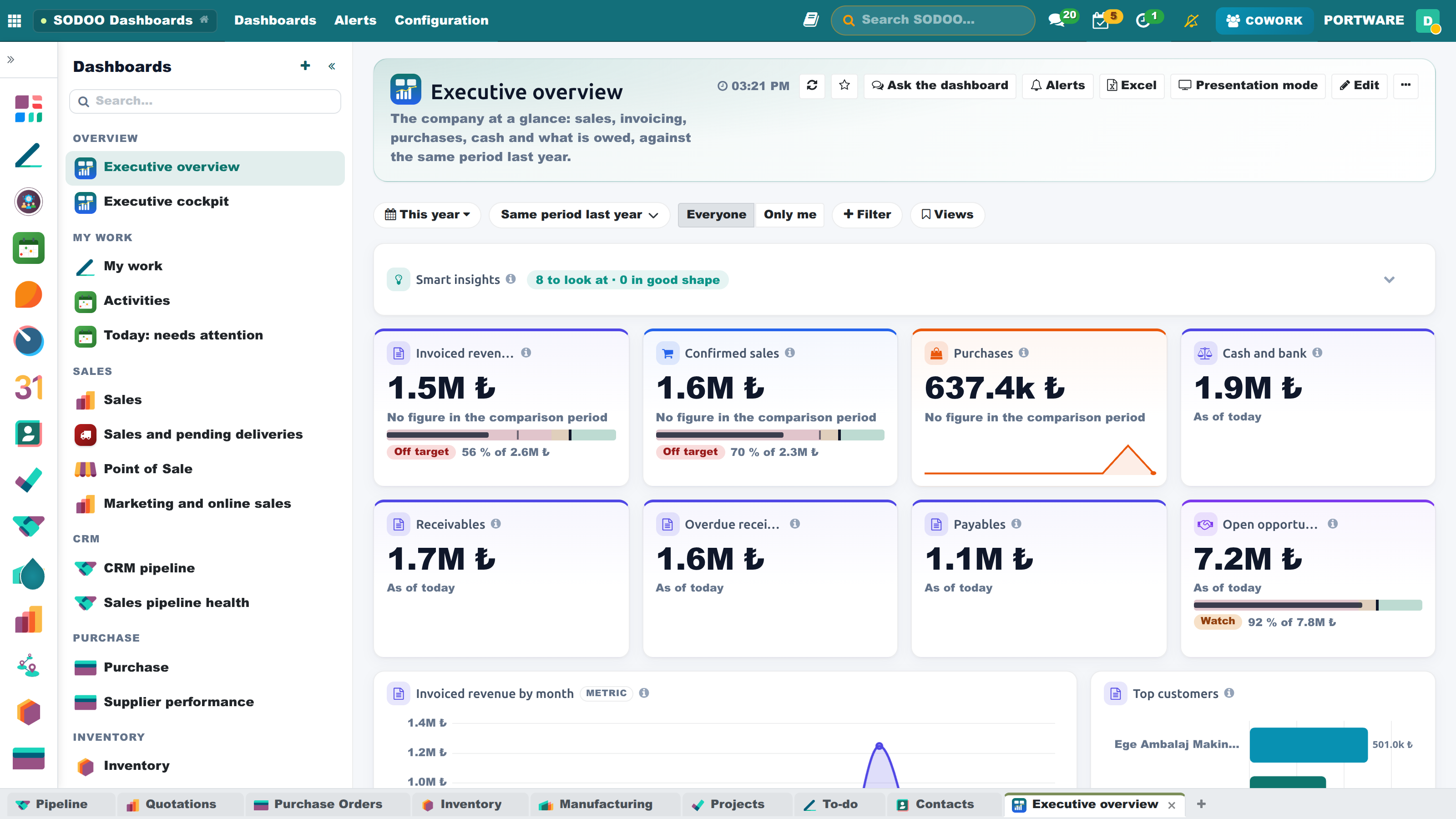
Executive overview - KPIs, revenue by month and top customers
Default Dashboards
The 28 dashboards below are created by themselves according to the applications installed in your database; the dashboard of an application installed later is added the first time the dashboard list opens. Each one is open to the team concerned; a widget over data you may not see stays in place and shows a lock: it says "You are not authorised to see this data" and names the data that needs the right (the count in the filter bar says how many widgets are locked). With a partial right only the records you may see are counted. In the list on the left, default dashboards show their app's own logo, pages you made a tile in their own colour.
| Dashboard | Who sees it | What it shows |
|---|---|---|
| Executive overview | Everyone | Invoiced revenue, confirmed sales, purchases, cash and bank, receivables, overdue receivables, payables, open opportunities; revenue by month, receivables by age, income and expenses |
| My work | Everyone (own records only) | My open and late tasks, my hours, my quotations, my profile, my activities |
| Activities | Everyone | Planned, overdue, due today and completed activities; by type, origin and person; completed by week; a list of overdue activities |
| Sales | Sales team | Quotations, orders, revenue, to invoice, quotation conversion, orders waiting for delivery, average order, units sold; monthly revenue, category, product family, country, sales team, customer and product breakdown, salesperson × month pivot |
| Point of Sale | Point of Sale users | Takings, tickets, average ticket, refunds; by day, shop, product, payment method and cashier |
| CRM pipeline | Sales team | Open opportunities, pipeline value, weighted pipeline, won and lost, win rate, average deal, overdue opportunities, lost revenue; stage, source, campaign, medium, country, lost reasons, leads and losses by month, forecast by expected closing, my activities |
| Purchase | Purchase team | Requests for quotation, orders, amount, late receipts; by buyer and product family, vendor × month pivot |
| Inventory | Inventory team | Operations to process, late and draft, backorders, units moved; receipts and deliveries by week, on hand by warehouse, stock value by category, top moving products, stock not shipped for 90 days |
| Manufacturing | Manufacturing team | Orders in progress and late, quantity produced, work centre load; quantity produced by product, open orders by responsible |
| Projects and timesheets | Project users | Open, overdue and closed tasks, late task share, people logging time, timesheet cost; hours by project and employee, project × month pivot |
| Finance | Billing users | Revenue, vendor bills, receivables and payables, cash and bank, open and paid invoices, items to reconcile, collection rate; income and expenses, ageing, overdue invoices, top vendors, customer and vendor payments, finance scorecard, revenue pivot |
| HR: my page | Everyone | Profile and check in/out, time off, attendance, expenses, tasks, my payslips, my hours by project; birthdays, announcements, events |
| HR management | HR users | Headcount, on leave today, time off to approve, attrition, contracts ending in 60 days, payslips, expenses to approve; department, leave type, contracts started and resignations, skills, leave days by department × month, Bradford factor, attendance and timesheet hours |
| Quality | Everyone (when the Quality app is installed) | Open, past their deadline, detected and closed nonconformities; by status, origin and severity, detected by month, root causes, a list of open nonconformities |
| Executive cockpit | Dashboard managers | Eight north-star metrics against their targets (sales and invoiced revenue, open pipeline, win rate, cash, overdue receivables, late deliveries and tasks); This period sentences, a target scorecard, monthly revenue |
| Today: needs attention | Everyone | What needs you today from every dashboard: unseen alerts, metrics off target, risks and warnings; your activities and this month's targets |
| AI and Cowork usage | Everyone (managers see everyone, others themselves) | AI cost (with a monthly budget), calls, success rate, active people, prompt cache share, cost per conversation; cost by day and provider, feature and model; adoption; who spends on what; median and slowest 5 % voice response times; interruptions |
| Cash and working capital | Invoicing users | Cash and bank, overdue receivables, DSO, DPO, DIO and the cash conversion cycle (from the finance KPIs); a 13-week cash forecast and its lowest point; ageing, largest overdue receivables, what to pay within 7 days |
| Sales pipeline health | Sales team | Open pipeline, win rate, won revenue, new opportunities; pipeline velocity and coverage; stage funnel, won and lost by month, lost reasons, salesperson × stage, sources; closing soon |
| Supplier performance | Purchase team | Spend, late orders, vendors used, days to receive; per vendor on-time delivery, days late, single-source risk; spend by category, vendor and month |
| Field service | Field service users | Open, late and completed service orders, planned hours; by stage, technician, type and territory; completed by week; late orders |
| Maintenance and fleet | Everyone | Open requests, breakdowns, mean time to repair (MTTR), preventive share; requests by month and kind, equipment that fails most, repair hours by team, vehicle costs by month |
| Repair and after-sales | Inventory team | Repairs in progress and opened, warranty share, waiting for parts; products repaired most, by status, month and customer |
| Project portfolio and OKR | Project managers | Active and at-risk projects, late milestones, logged hours; project health, hours by project, open tasks by age, key results by confidence, objectives of the active cycle, projects at risk |
| Engineering changes (PLM) | Everyone (when PLM is installed) | Open ECOs and ECRs, ECO cycle, decision time; changes by state, reason and month; open change orders |
| Recruitment, leave and expenses | HR users | New applicants, time to hire, leave days, expenses to approve; hiring funnel, applicants by job, time off by type, overtime by employee, expenses by department |
| Marketing and online sales | Everyone | Website sales, open carts, event registrations, campaign e-mails opened; website sales by day, e-mails by result, registrations by event, survey score by survey |
| Dashboard usage | Dashboard managers | Which dashboard is opened by how many people, dashboards not opened for 60 days and widgets nobody uses |
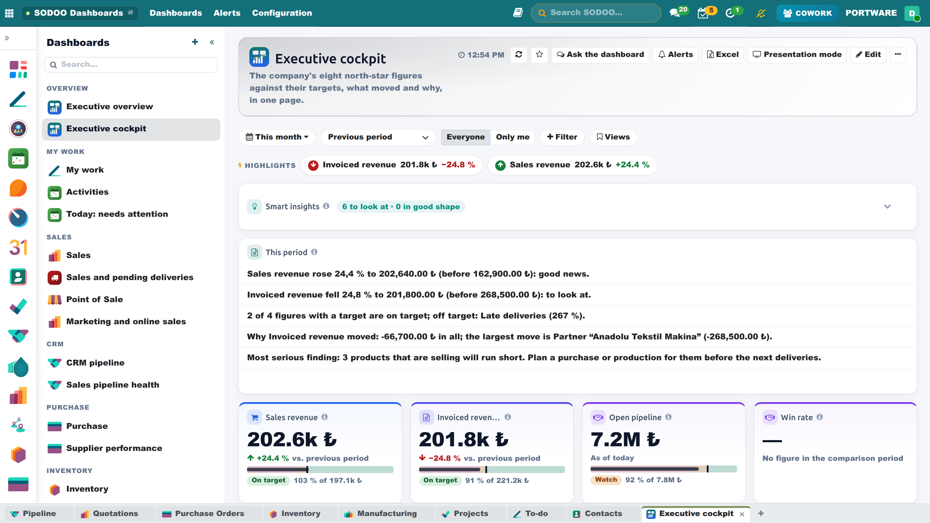
Executive cockpit - metrics against their targets, this period in sentences
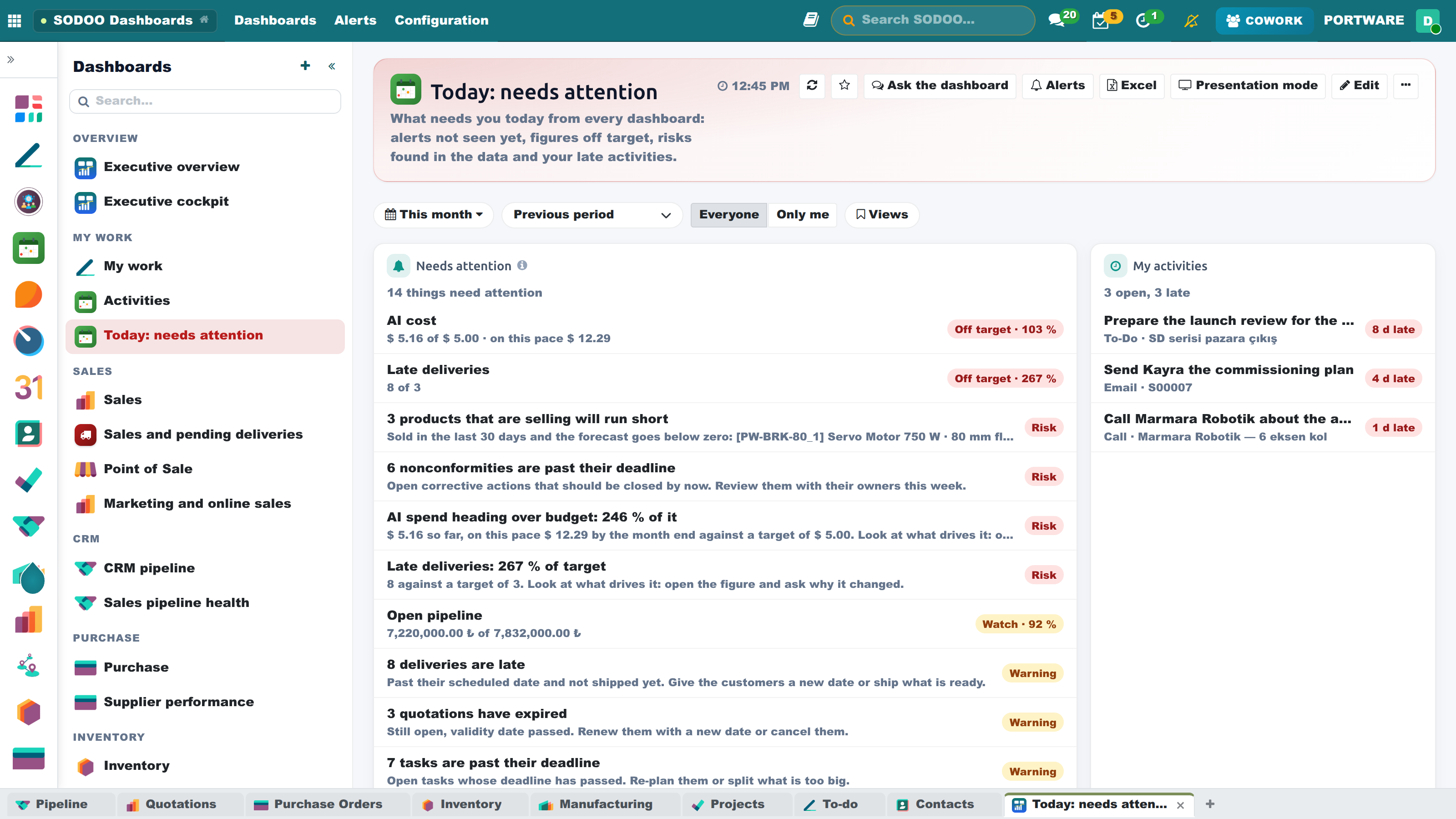
Today - what needs you from every dashboard
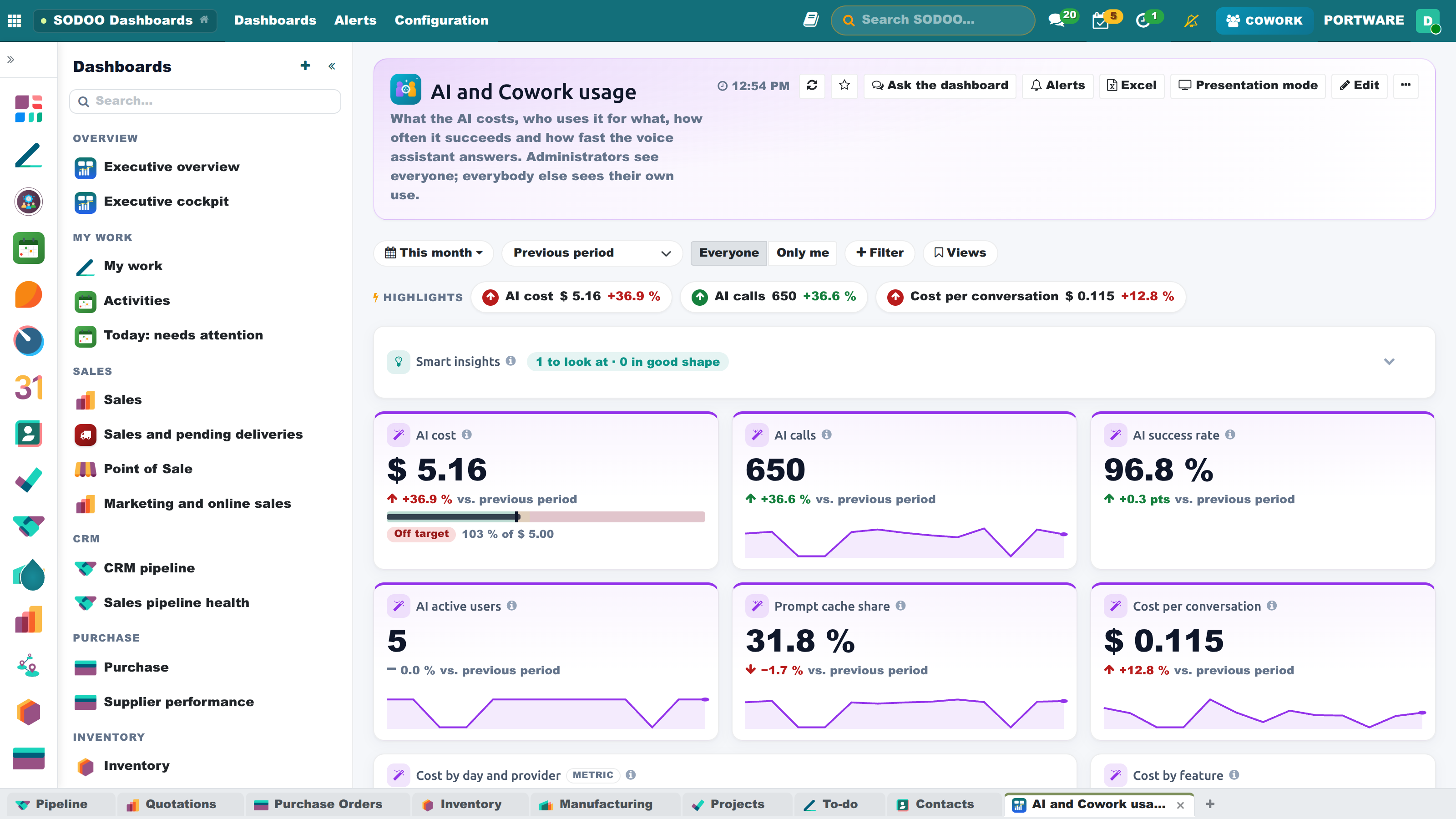
AI and Cowork usage - cost, budget, adoption and voice times
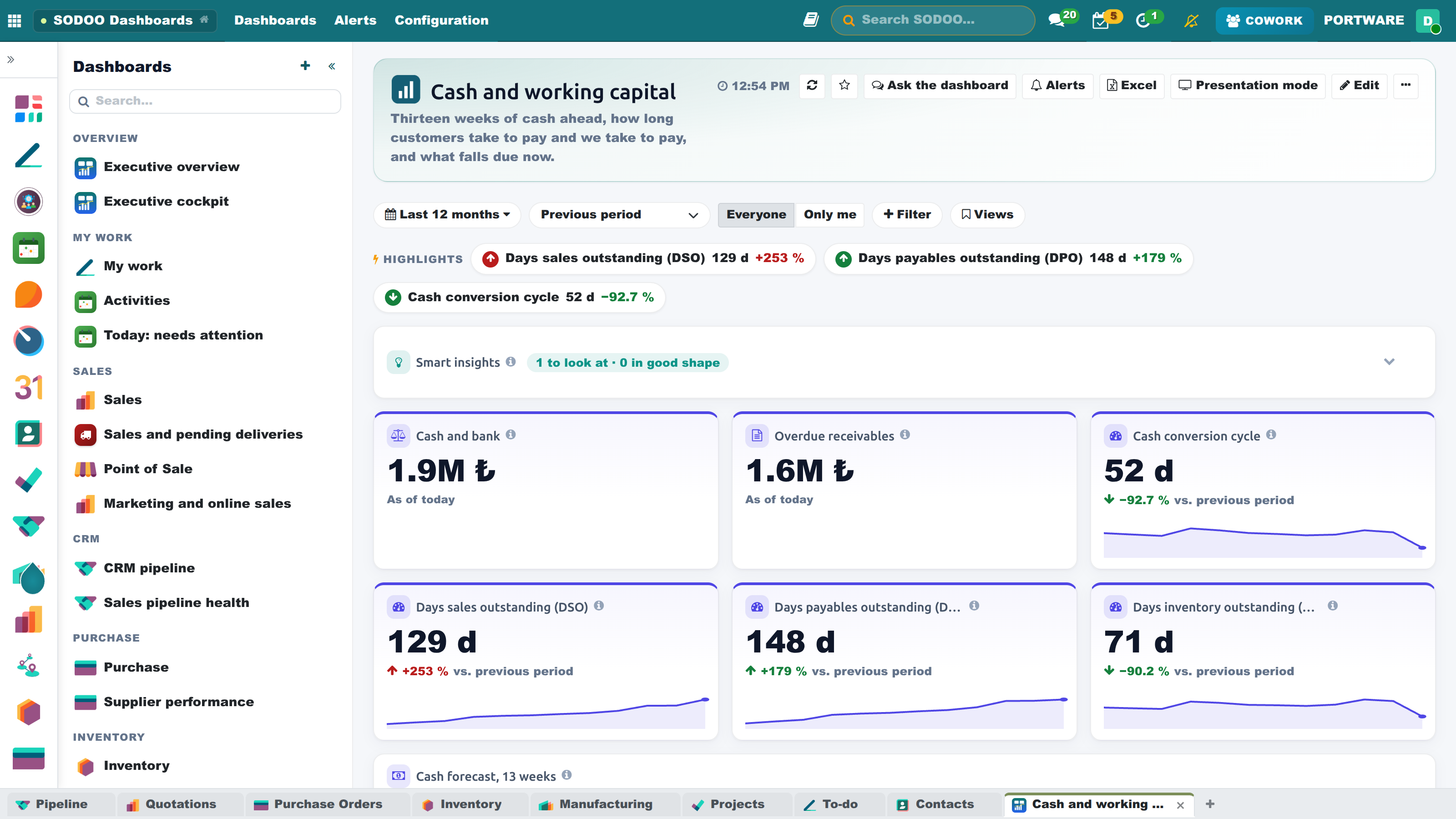
Cash and working capital - DSO, DPO, DIO and the 13-week forecast
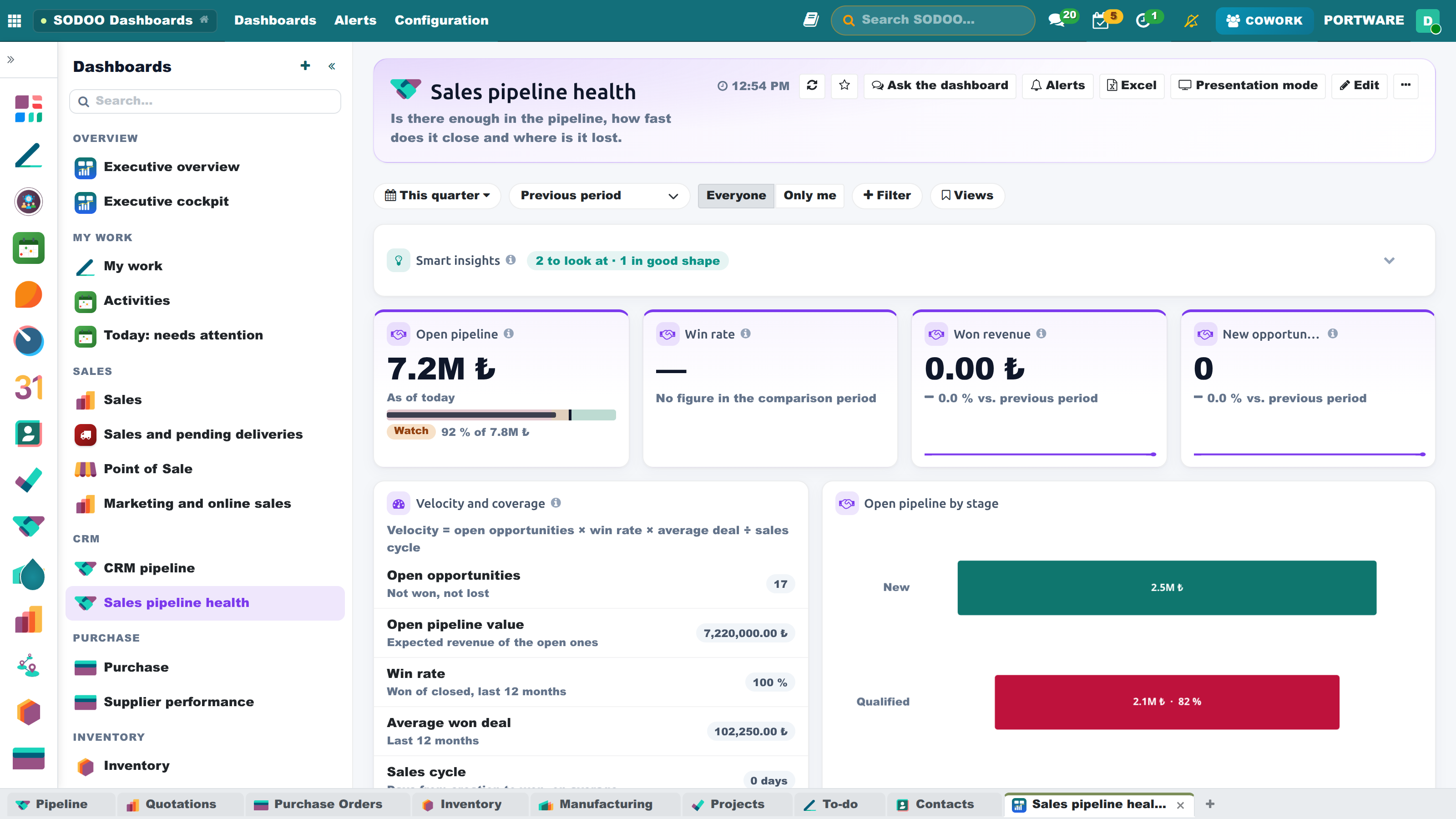
Sales pipeline health - velocity, coverage and the stage funnel
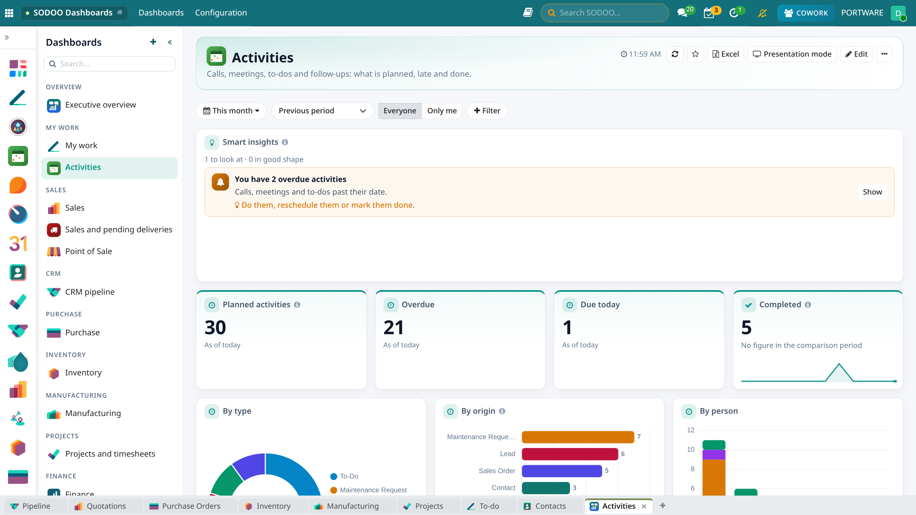
Activities - planned, overdue and completed; by type, origin and person
If you changed a default dashboard, Settings and sharing → Reset to default brings it back.
Smart Insights
Every default dashboard opens with Smart insights: before you start any analysis, it lists the risks, warnings and good news found in the live data. Each insight says what is happening in one sentence and what to do in a suggestion; Show opens the records behind it. The checks run only on data you are allowed to see.
| Area | What it looks for |
|---|---|
| Stock and sales | Products sold in the last 30 days that ran out of stock or whose forecast goes below zero; late deliveries |
| Sales and CRM | Quotations expiring this week and already expired; the sales trend against the same days last month; opportunities with no next activity, untouched for 14 days |
| Projects | Projects with open tasks where no task changed and no hours were logged for 14 days; tasks past their deadline |
| Finance | Overdue customer invoices and their amount |
| Purchasing, manufacturing, quality | Late receipts, late manufacturing orders, nonconformities past their deadline |
| HR and activities | Time off waiting for approval; your overdue activities |
The Highlights line at the top of a dashboard names the three indicators that moved most against the comparison period, good or bad; a click expands that indicator. Add insights to your own page with Add widget → Smart insights and pick the areas it watches with Insight areas.
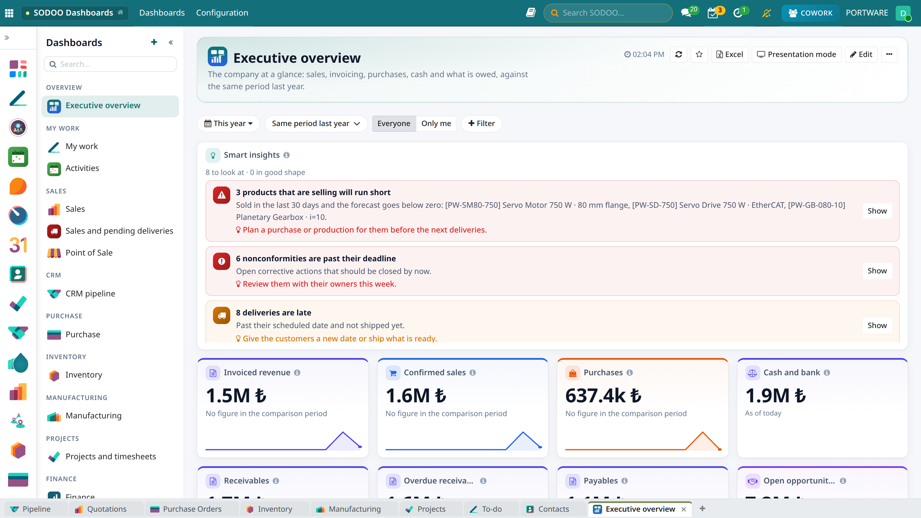
Executive overview - smart insights at the top
Metrics and Targets
A metric is a figure defined once: which records, which measure, which date, which direction is good news, its owner and its targets. Every widget built on a metric takes its definition from it, so the same question gets the same answer on every dashboard, in alerts and in Cowork. Change the definition on the metric and every widget built on it follows. The beside a widget's title gives its definition and the metric it is built on.
- Ready metrics: sales revenue, confirmed orders, average order, invoiced revenue, open pipeline, win rate, won revenue, purchase spend, late deliveries, overdue receivables, cash and bank, late tasks, logged hours, open nonconformities and the AI metrics. The finance suite's DSO, DPO, DIO, cash conversion cycle, current ratio, gross and net margin are metrics too: their formulas and targets come from the finance suite; no second definition is made.
- Setting a target: open the metric under Configuration → Metrics and targets and add a date range and a value on the Targets tab. A sum (revenue, cost) takes its share of a target by days: a yearly quota of 1.2 M is 100 k for a month; a rate or an average keeps the value in force. A target with a person (a salesperson's quota) applies when the dashboard shows only that person. The metric's owner or a dashboard manager sets targets.
- Bands: by default 100 % of the target and above is green (On target), 90 % and above amber (Watch), below red (Off target). Where lower is better (cost, late deliveries) the scale is mirrored: under the budget is green, up to 110 % amber.
A KPI with a target is drawn as a bullet chart: the bands behind, the figure as a bar, the target as a vertical mark. Under it a pill names the status in a word and the share of the target reached. In a running period (this month, this year) the status follows the pace: 35 % of the target on the 10th, with a third of the month gone, is on track. A dashed mark shows where the pace leads by the end of the period; taller cards write it out.
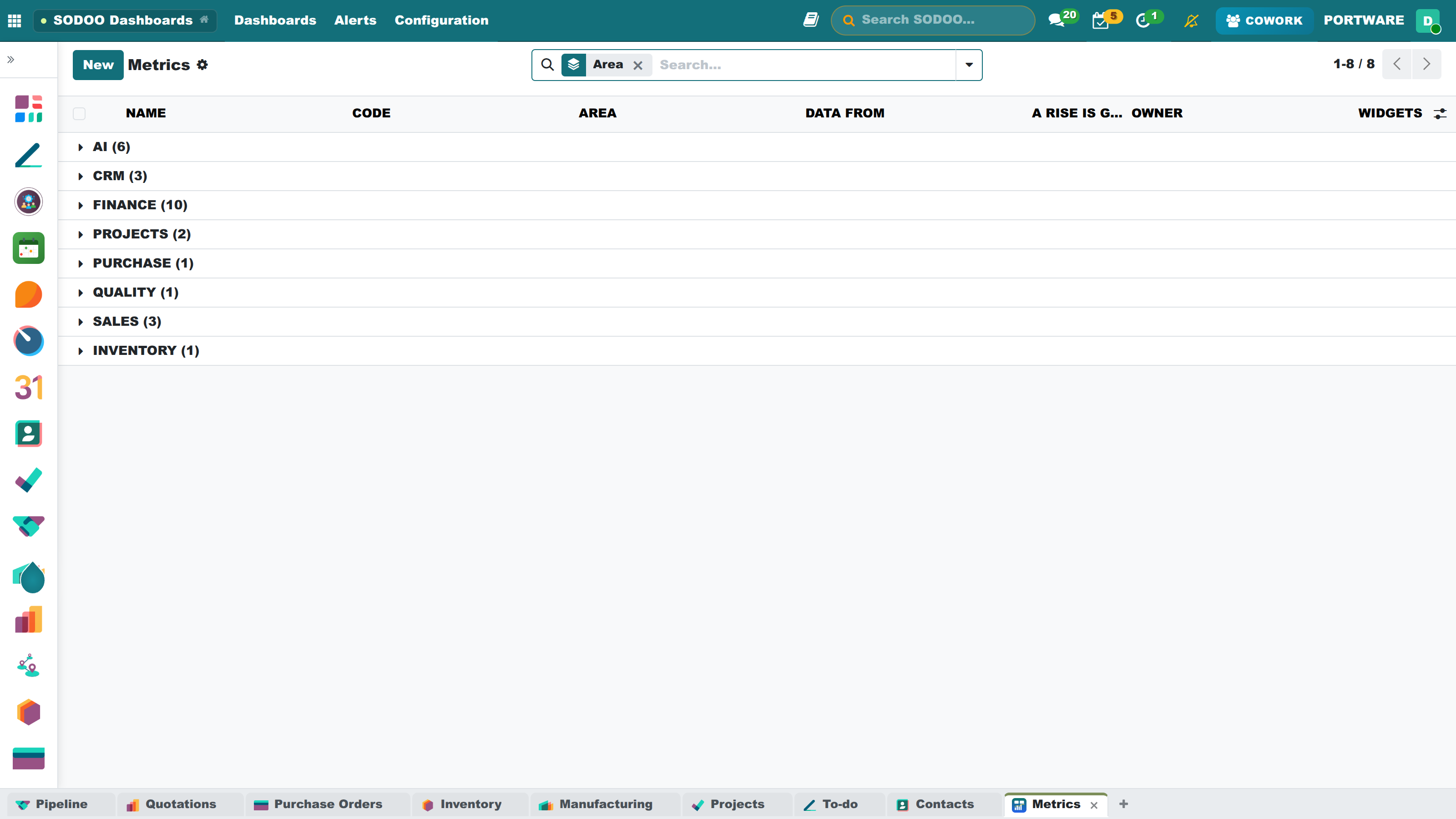
Metrics and targets - by area, with owner and widgets
AI cost: the same figure as the provider's bill
Every call's AI cost is the provider's own token, character or audio count at the provider's published price; every line of the price table carries its source and the date it was read. The provider's own figure is read too and shown beside it in Provider bills against what was measured (administrators only): ElevenLabs gives what it billed per model and day through its usage API, OpenAI and Anthropic through their cost APIs (once an admin key is entered), DeepSeek through its balance; for Gemini and the others the invoice is entered by hand. The provider's figure covers the whole account: every installation and app using the same key is on it, meeting notes included. With a key per installation the two compare line by line. Meeting-notes transcription is in the ledger too.
Answer time, failures and acceptance by model shows the Cowork turns of the last 30 days model by model: turns, median and slowest 5 % answer time, time to the first words, the share of turns with an error, of actions approved, of answers asked again, corrected or refused, and the cost per turn -- each model compared on speed, quality and cost together.
Why Did It Change?
Why did it change? in a KPI's menu splits its change against the comparison period by every angle (customer, product, category, salesperson, team, stage, country...). For each angle the largest rises and falls are listed: the value before and now, the difference and, for figures that add up, the share of the whole change it carries alone. Angles come in the order they explain the change, under one sentence ("−66,700 in all; the largest move is Partner “Anadolu Tekstil”"). A click on a value splits it by the remaining angles -- the customer, then that customer's product categories, then the products: a layered decomposition tree; opens the records behind it. A metric may name the angles to ask first.
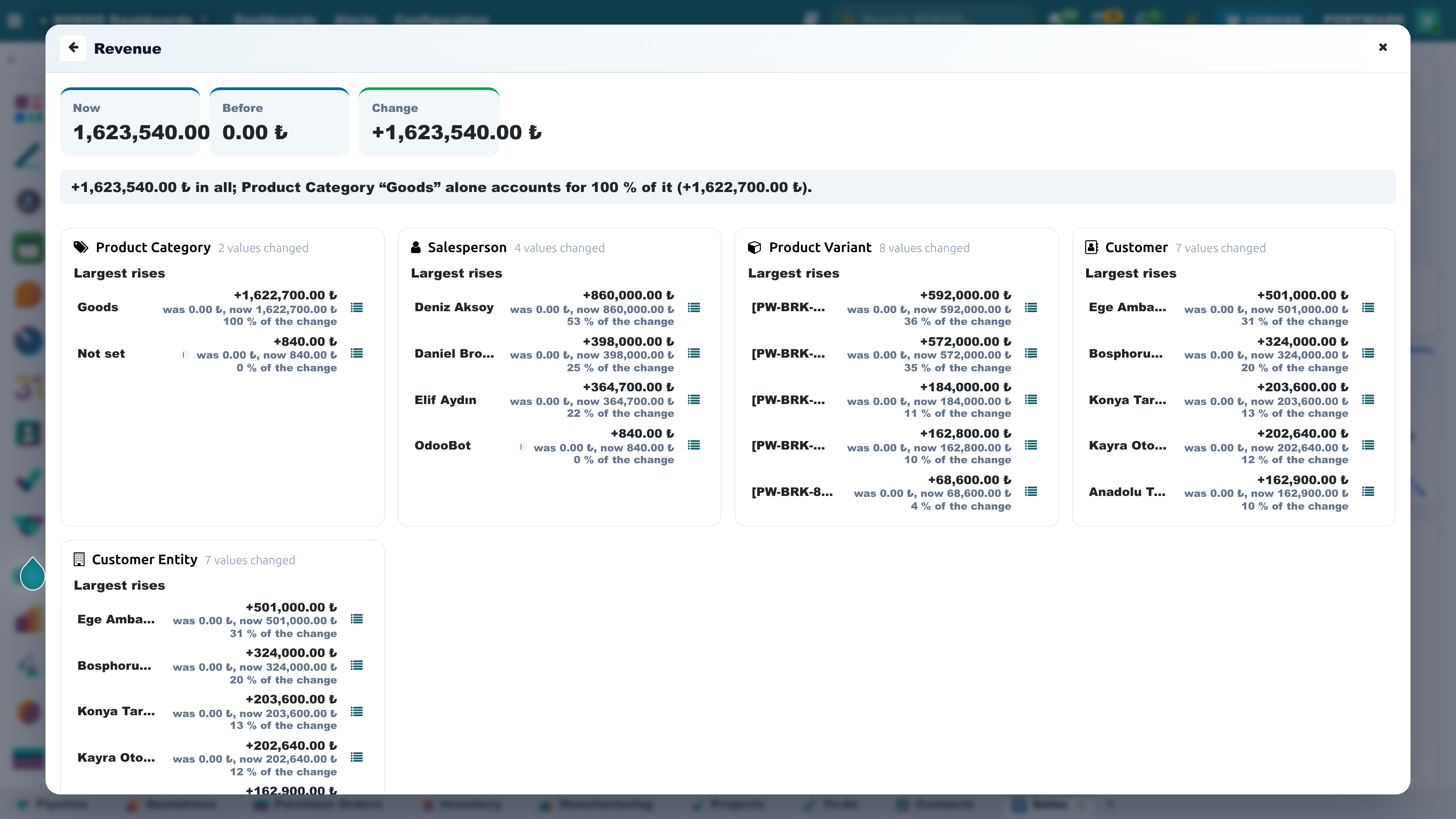
Why did it change? - the change, largest rises and falls by angle
Follow, Alerts and Your Digest
Follow and alert me in a KPI's menu follows the metric behind it, or the widget, and the card says Followed. Change the alert in the notification sets when you hear about it:
- when it falls off its target (its pace falls short), goes above or below a value, changes by more than a share against the period before, or has an unusual day: yesterday outside the average ± 2 standard deviations of the same weekday over the eight weeks before. The rule is simple on purpose; you can recompute it by hand.
- An alert comes when the condition starts, not at every check while it lasts; at most ten alerts a day reach a person, the rest wait in the history and the digest. Alerts arrive as Odoo notifications, by e-mail if that is your preference.
- The Alerts menu holds Followed figures (silence 1 day / 1 week, pause, resume, check now) and Alert history (when, which value, sent or not, seen or not). The dashboard's Alerts button counts the unseen ones.
- Your digest: from the same menu choose the e-mail digest Every morning, Every Monday or Off; Preview my digest shows it as it would be sent now: the figures you follow, the five that moved most, what is off target, new risks and warnings and the alerts sent. Your first follow turns the weekly digest on.
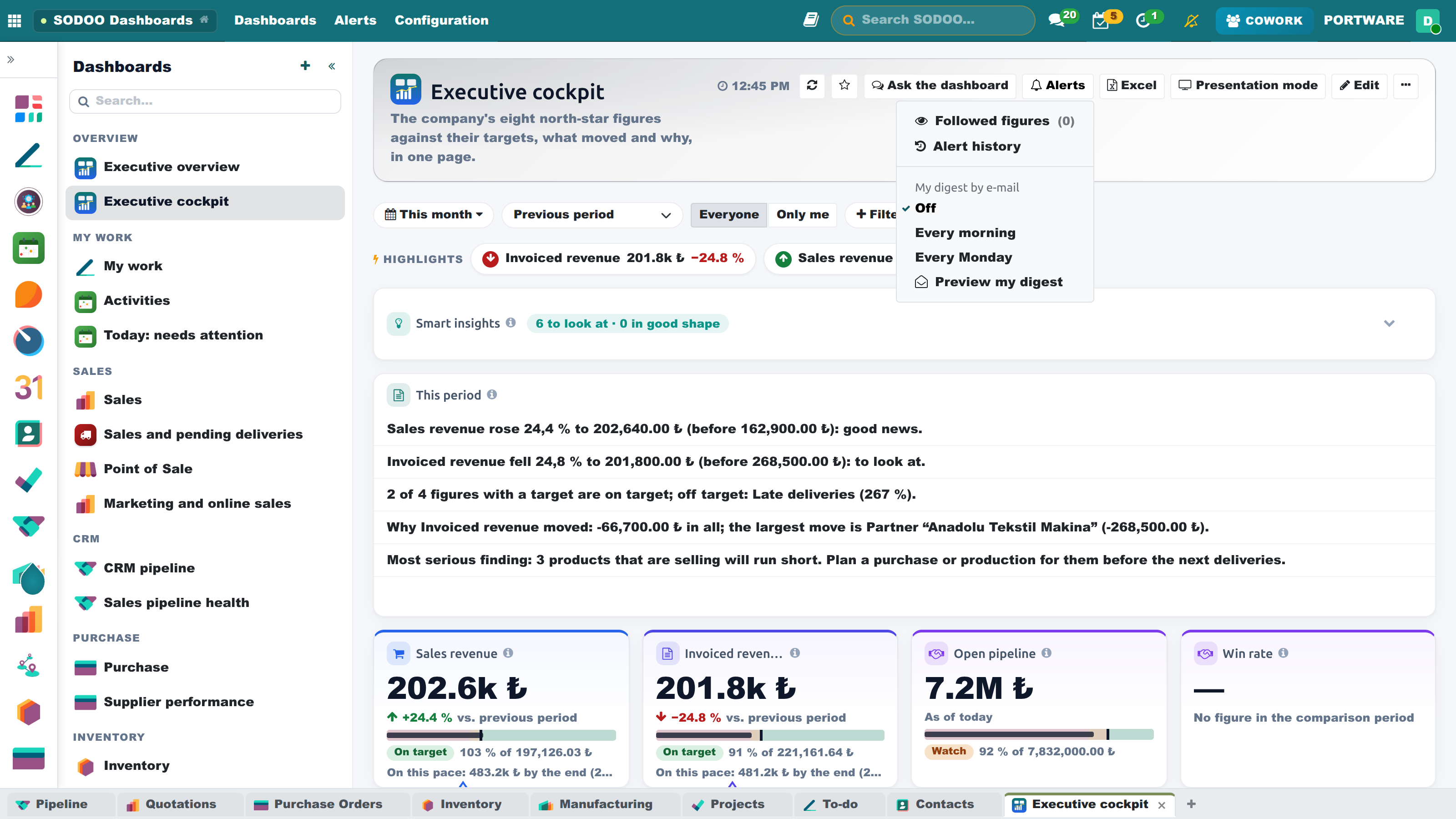
Alerts - followed figures, history and the e-mail digest
Saved Views, Notes and Colours
- Views: Views → Save this view in the filter bar keeps the period, comparison, filters, picks and the widgets shaped your way under a name. Share it with every reader of the dashboard; Open the dashboards on this view makes it your landing page.
- Notes: Notes in a widget's menu pins a remark to the figure, or to a month, bar or row ("March: the plant was closed two weeks"). The Notes count in the title, the card in presentation mode and the Notes sheet of the Excel show them. The author deletes a note.
- Colour-blind safe colours: in the ⋯ menu; green/red become blue/orange and the chart palette Okabe-Ito. The choice stays in your browser. Colour is never the only carrier anywhere: statuses are words, changes carry their sign and "better / worse".
- Small multiples: the Small multiples chart type draws one small chart per value of the second grouping, on one scale.
- Speed: figures are asked for four at a time; widgets below the screen are computed when you scroll near them. A slow widget (a large pivot) is remembered for a minute per reader and options; Refresh skips that. Presenting and printing load every widget.
Your Own Dashboard Pages
Every user builds dashboard pages of their own; there is no need to wait for a ready one. A page starts in one of three ways:
- Blank page: the above the list (New dashboard). Give the name, icon, section and default period, then fill it with Add widget.
- Copy: on a dashboard you like, ⋯ → Copy as my own. The copy is yours; change it as you wish without touching the original.
- Import: ⋯ → Export definition downloads a dashboard with all its widgets as a small JSON file. In another database, or a colleague, loads that file with ⋯ → Import a dashboard (or Configuration → Import a dashboard) and picks the name and visibility there. Every model and field in the file is first checked in that database.
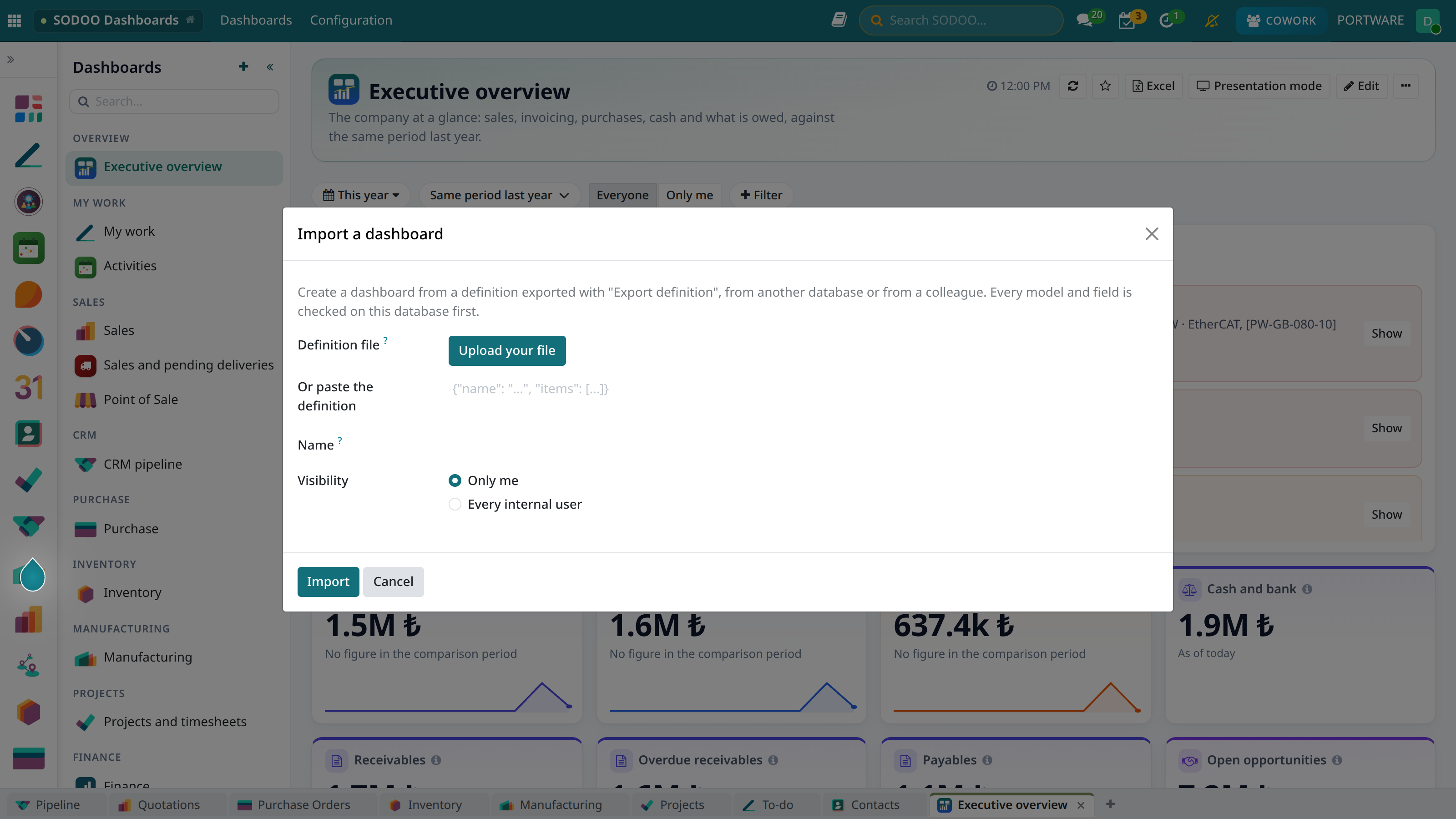
Import a dashboard - upload a file or paste the definition
Example: the Sales and pending deliveries page is the live version of the "stock consumption forecast" workbook prepared in Excel. At the top sits the stock projection: for every product, stock on hand, reserved and free; open deliveries and components to be used in manufacturing; purchases and manufacturing coming in within 60 days; the projected stock, open quotations and what is left after them. Products are grouped in their category's colour; those running short are red. Below: the same projection summed by category, who gets what as product × customer, the customer potential from quotations, a line for every open delivery; then pending orders, total sales, quotations and open opportunities.
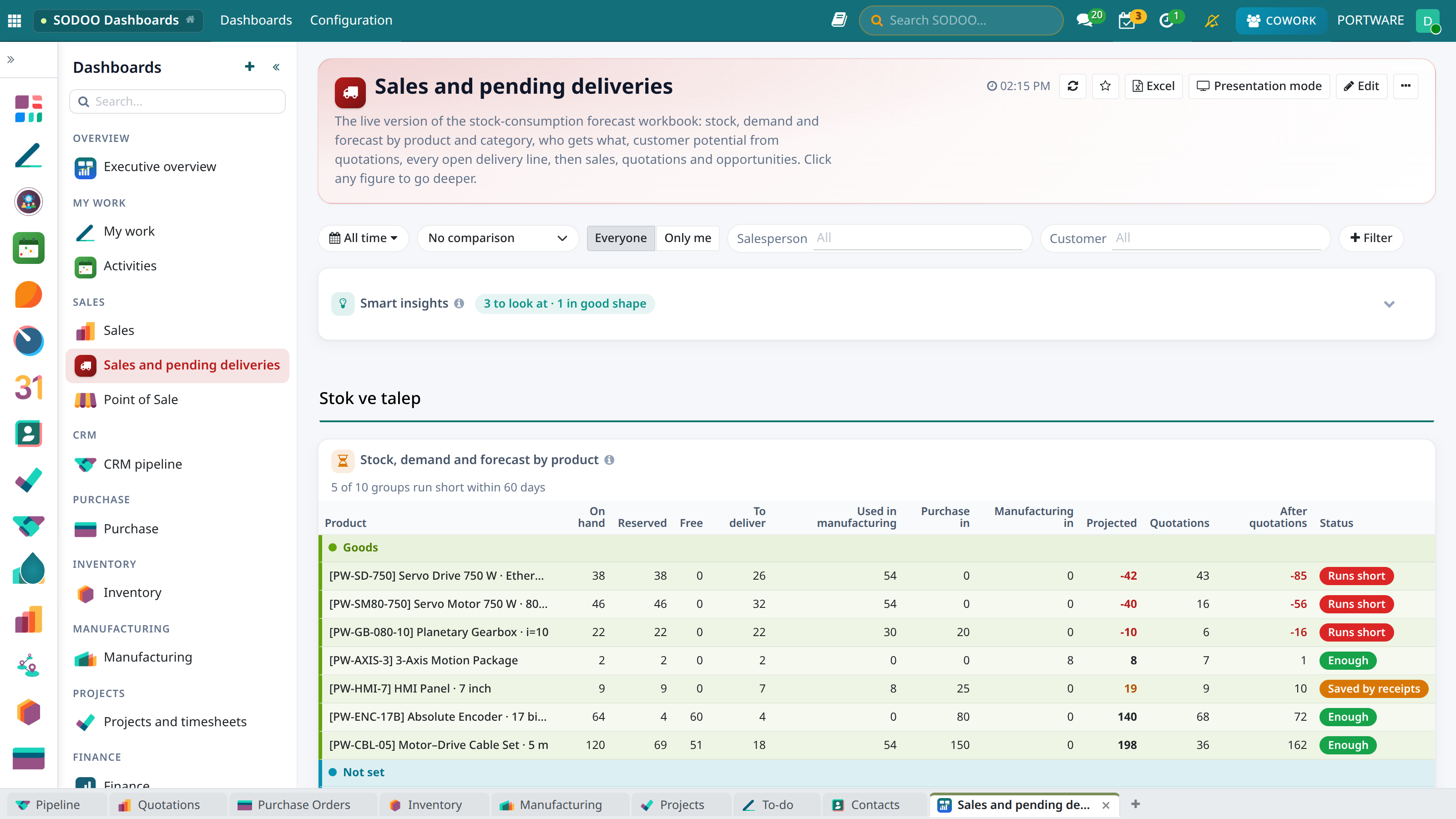
An example of your own page - pending deliveries, sales and quotations
The Filter Bar
What you pick in the bar applies to every widget of the dashboard:
- Period: today, this week, month, quarter or year, the last 7/30/90 days, the last 12 months, last month/quarter/year, custom dates or all time. Figures without a date field (receivables, stock on hand) ignore the period and say As of today.
- Comparison: the previous period or the same period last year. A running period is compared to date: on the 12th, "this month" is set against the 1st-12th of last month. Green is good news, red bad news; for figures like late tasks a rise is red.
- Everyone / Only me: "Only me" keeps your own records in every widget that has a user field.
- Dashboard filters: salesperson, sales team, partner, department, project... Each filter takes several records (two salespeople, three customers): the page shows what belongs to any of them. Every widget whose model has a field pointing there follows the filter; one it does not apply to shows in its title.
To open with these choices, use ⋯ → Open with these filters.
Shaping a Page to a Question
Without editing the dashboard you can turn it to the question you have now; this applies only to you and only now, the saved dashboard does not change:
- Click to filter: click a customer, product or salesperson bar (or slice); every widget on the page filters to it. The chart you clicked keeps its whole picture with your pick highlighted. The pick stays in the filter bar as a chip: opens the records, removes it. You can pick on several charts.
- + Filter: the Records part of the menu adds a filter with several records for any record type the widgets point at (customer, product, product category, salesperson, sales team, warehouse, project, department...). The Fields part lists status and yes/no fields (Status first): tick one or more values and the page narrows to them. Combine as many filters as you like; they all apply together. Each filter stays in the bar as a tag: changes its values, removes it. A widget without that field ignores the filter and says so in a note. Filters go into saved views and into the Excel heading too.
- View by: the View section of a chart or pivot menu shows the same figure from another angle: by week, month, quarter, year; by salesperson, customer, product, category, product family, country, team. The choices come from the fields the widget's data has. Ordering is smart: by time it reads chronologically as a line, otherwise largest first.
- Order and limit: largest first, smallest first, natural order; top 5, 10, 20 or all.
- Fold: the on any widget title brings it down to one line; a short summary stays beside the title (a KPI's value and change, the number of insights) and the widgets below move up. opens it again; the choice is remembered for that dashboard in this browser.
- Chart type: bar, horizontal bar, line, area, doughnut or funnel. The beside the title says the view is your own; Back to the saved view undoes it.
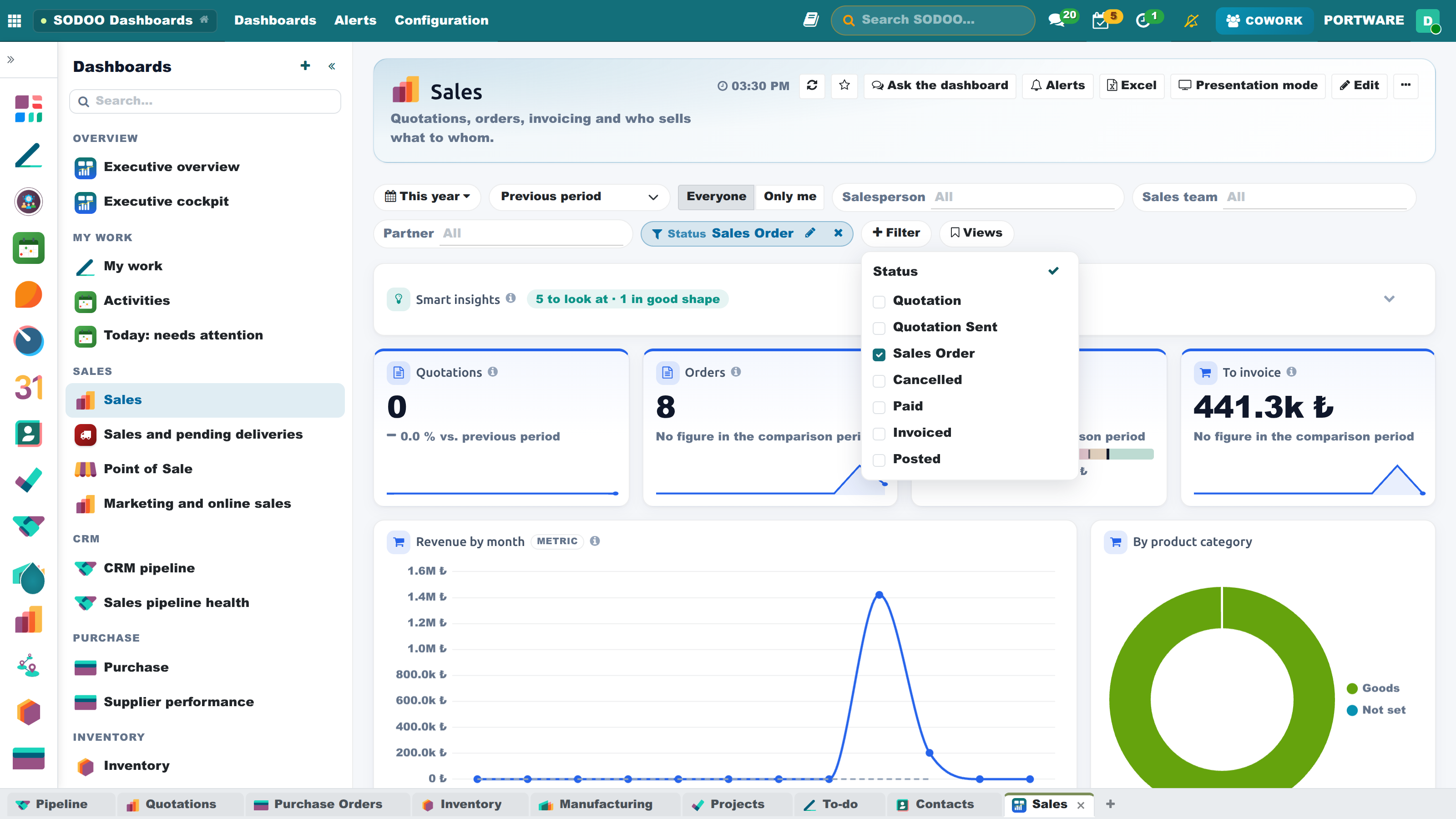
Sales Order ticked in Status: the page counts confirmed orders only
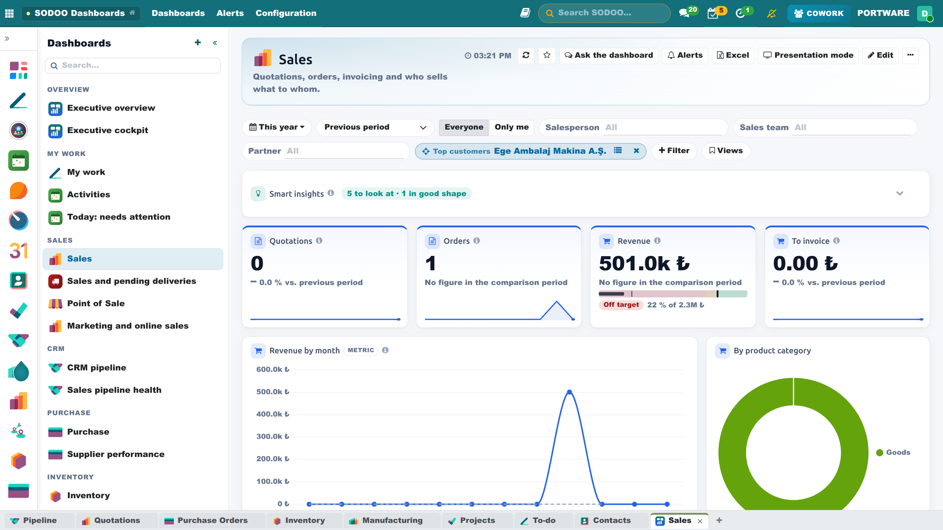
The largest customer was clicked: the whole page filtered to that customer
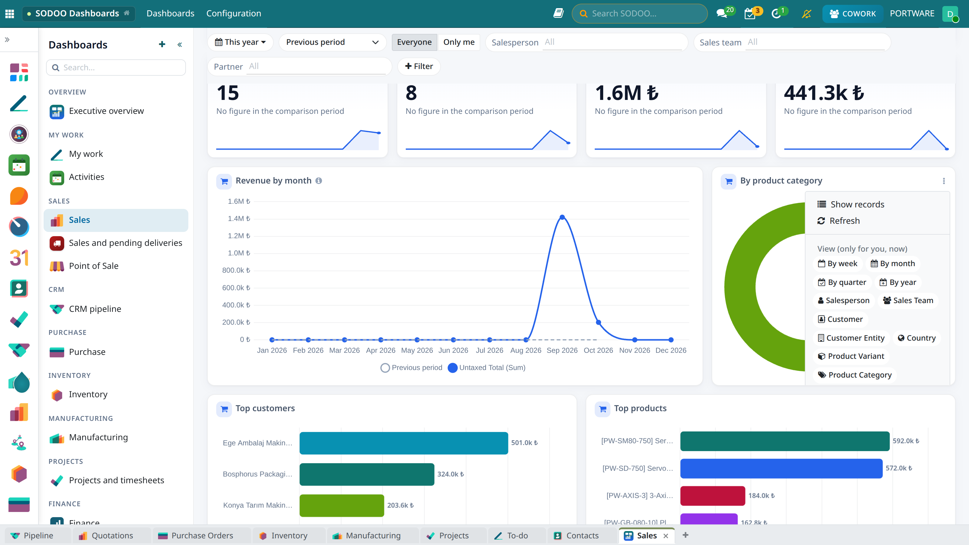
Chart menu - view by, order, top N and chart type
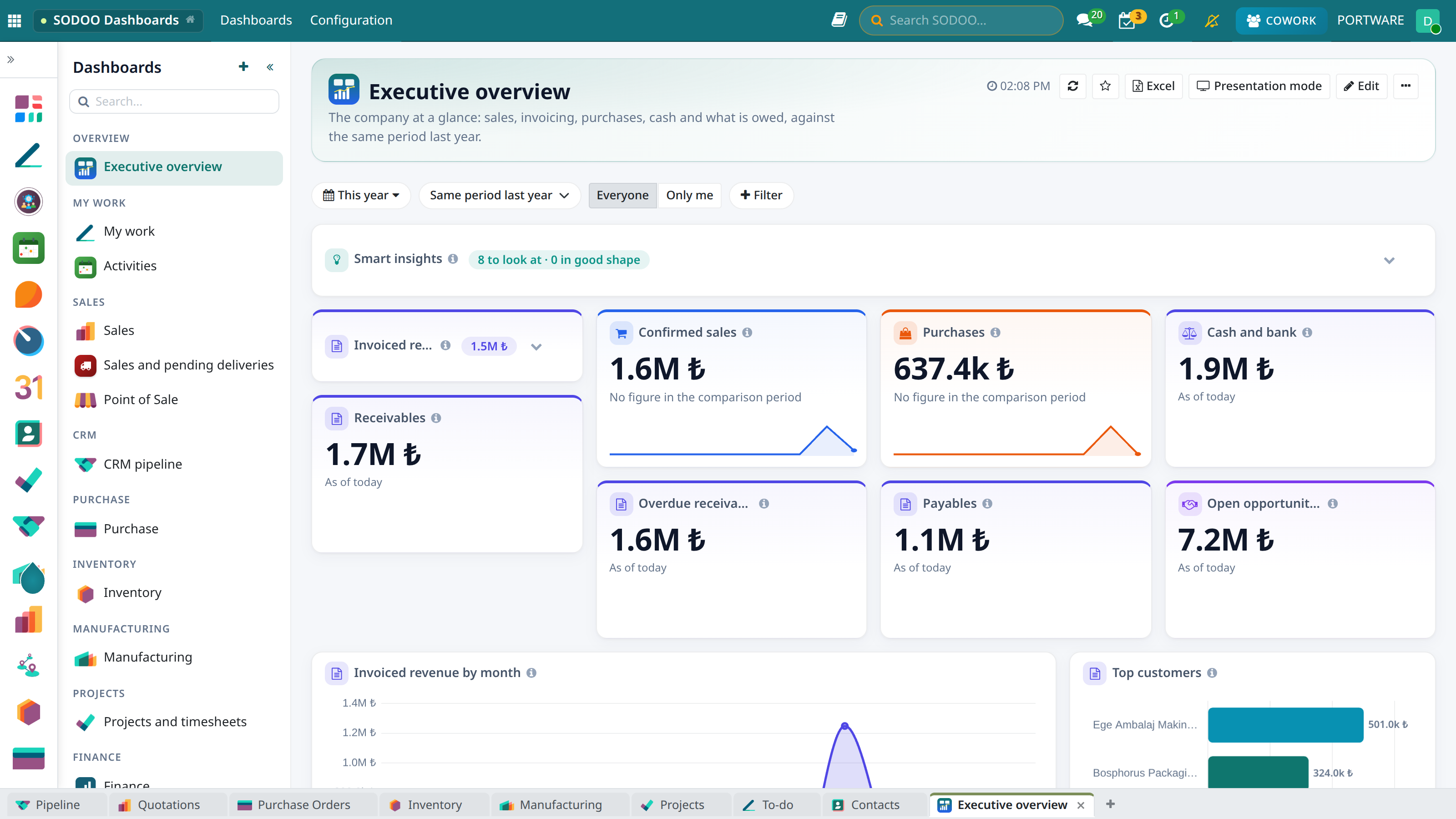
Smart insights and a KPI folded: the title line and its summary stay
Widget Types
| Type | What it shows |
|---|---|
| KPI | A single figure or a ratio (e.g. win rate, quotation conversion); change against the comparison period (in points for ratios), a trend line over the period and an optional target bar |
| Chart | Bar, horizontal bar, stacked, line, area, pie, doughnut, funnel (with the rate between steps). Figures are written on the bars; grouped by anything but a date, every group gets its own colour. One or two groupings, top N + "Others", running total, the comparison period as a dashed line |
| Table | The records themselves: chosen columns and order; the total row adds up every matching record |
| Pivot | Rows × columns (e.g. salesperson × month) with totals, the shape of Excel reports. Every month of the period is a column |
| Gauge | Progress against a target |
| Text | A section heading or a note |
| Built-in widget | My activities, employee card and check in/out, birthdays, announcements, events, aged receivables/payables, income and expenses by month, stock value, stock not shipped for 90 days, joiners and leavers by month, attrition, finance scorecard |
The next to every widget title gives the figure's definition: what is counted and by which date.
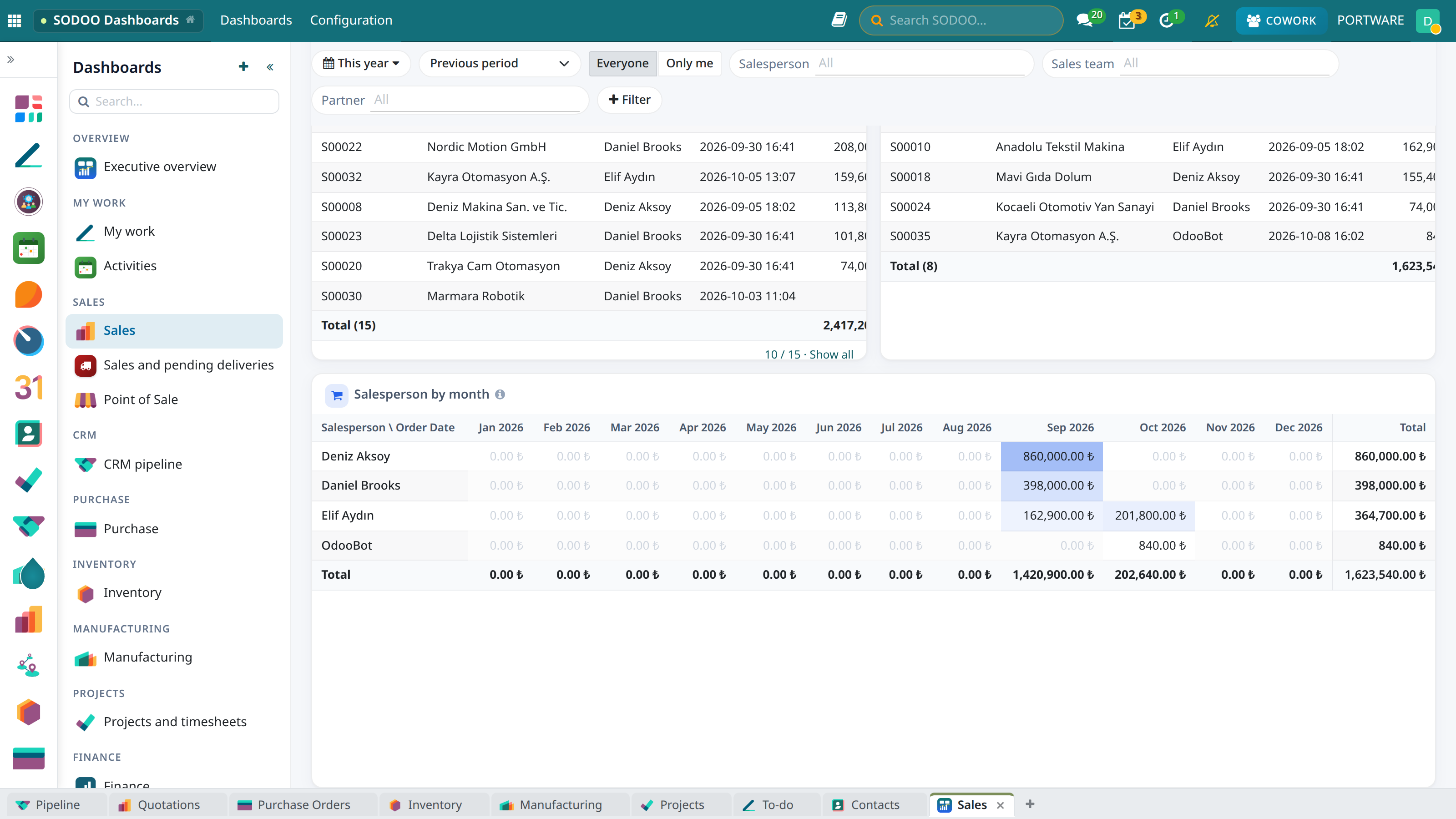
Sales - tables and the salesperson × month pivot
Drill Layers
Click a KPI, a bar in a chart, a pivot cell or Show on a smart insight: the records behind it open not as a flat list but as a small dashboard of their own. Record count and amount totals on top, three breakdowns from the records' own fields in the middle (salesperson, customer, product, stage…), the records below. A click on a breakdown bar goes one layer deeper; a product row opens the product page, other rows open the record itself. In the stock projection a category row opens that category's products with the same figures (on hand, to deliver, coming in, projected, status); each product then opens its own page. The breadcrumbs move between layers, or Esc goes back one layer (from the first layer, back to the dashboard), Open as list opens the same records in an Odoo list.
The product page answers: how much do I have (on hand, reserved, free), how much goes to whom (open deliveries by customer and document), which quotations wait for an answer, what is coming in (purchase and manufacturing), how much manufacturing will use and where the stock is. Projected and After quotations turn red when they go below zero.
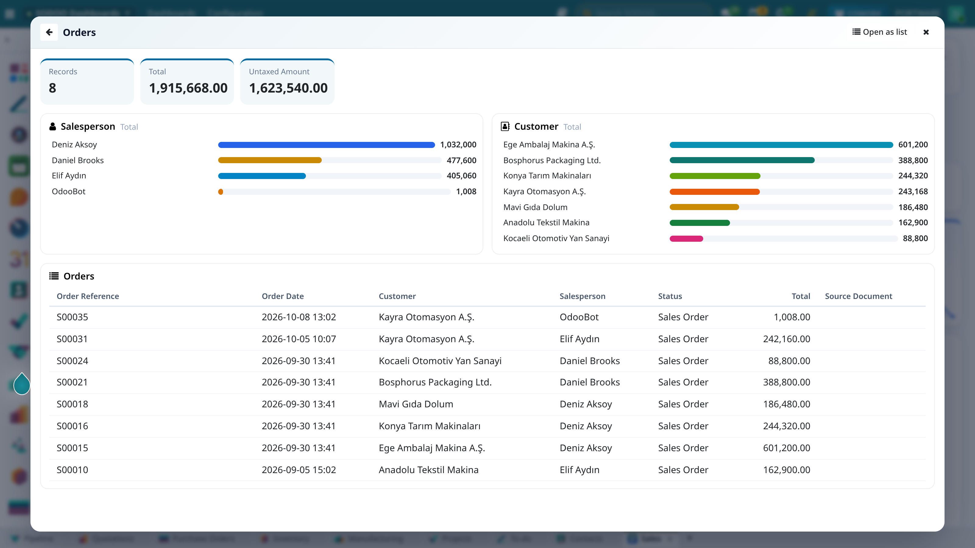
A KPI's layer: totals, breakdowns and records
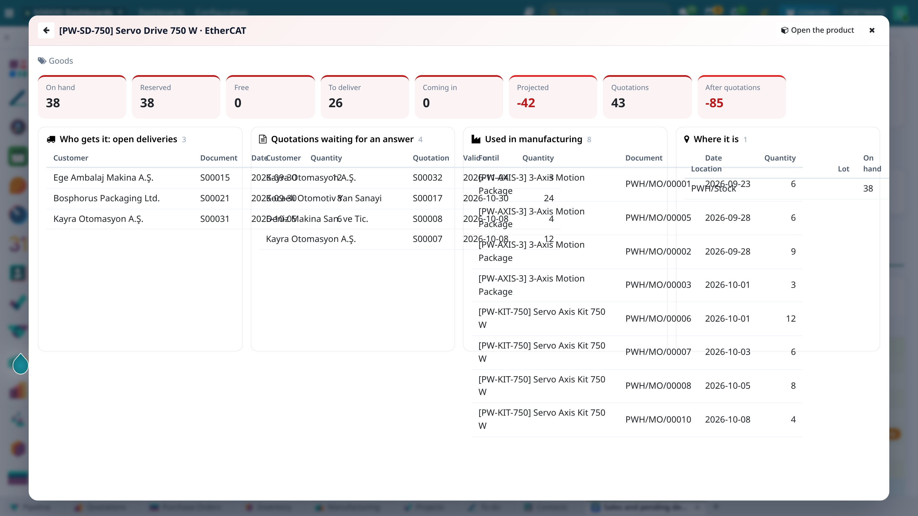
Product page - how much there is, who gets how much, what is coming in
Stock Projection
The Stock projection of open orders built-in widget shows how open work drains stock: open deliveries and the components of open manufacturing orders come off the stock on hand, purchase receipts and manufacturing output due within the horizon come on. It shows by product category, product family or product; by product, products are grouped in their category's colour. Status: Runs short (red), Saved by receipts (amber), Enough (green). The widget settings choose Horizon (days), Count purchase receipts and Count manufacturing. It heads the Inventory dashboard and can be added to any page from the library; Excel brings it with group and product sheets.
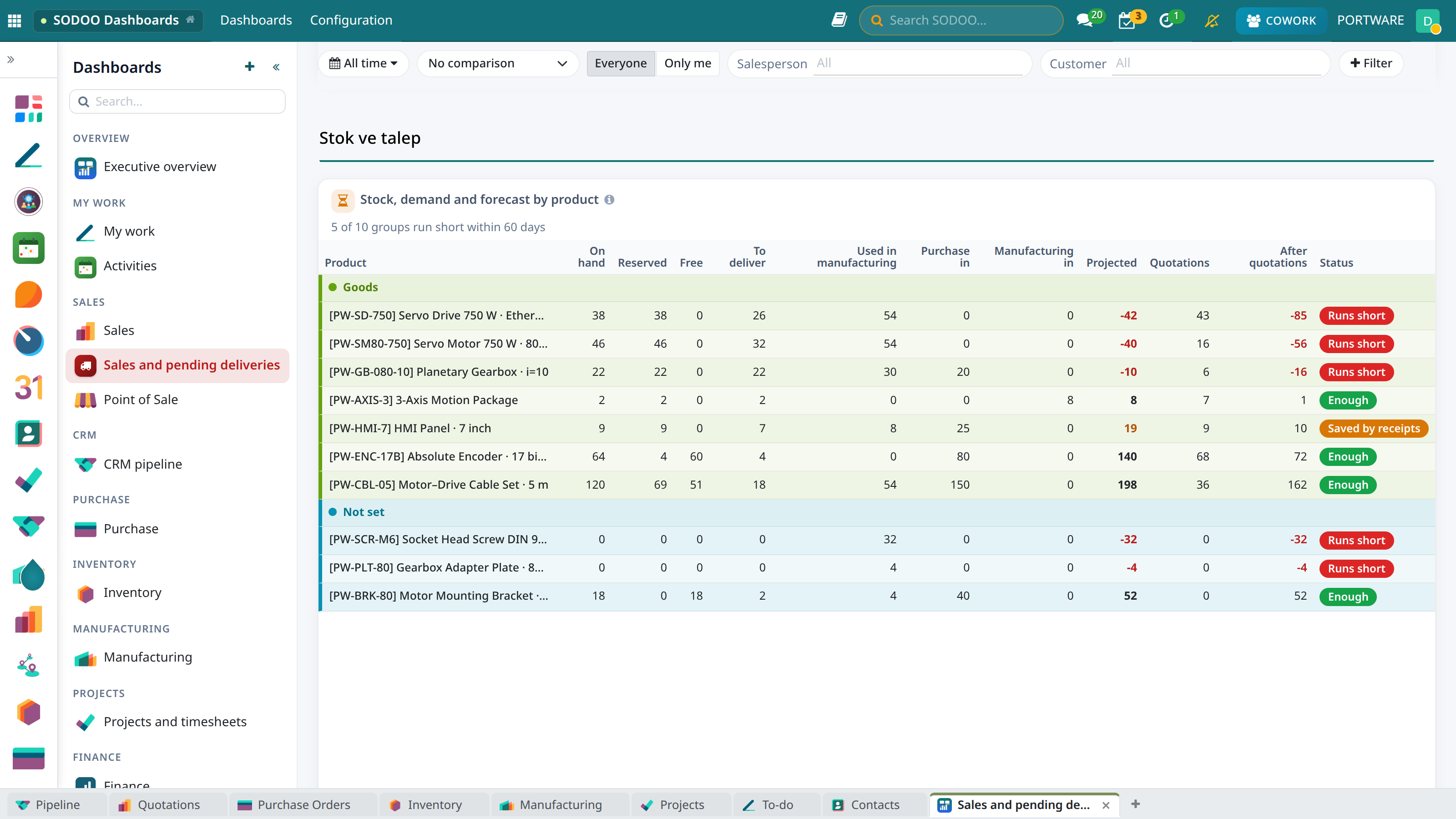
Stock projection by product - categories in their own colour, products running short in red
When pivot rows are products, they group by their category on their own and each category opens with a header line in its colour; the widget's Band rows by field picks another field (e.g. categ_id.parent_id).
Editing a Dashboard
Press Edit. Move a widget by dragging its title, resize it by pulling its bottom right corner (12-column grid); the change is saved at once. Add widget opens the widget library: every widget of the default dashboards, grouped by area and searchable; pick several and add them in one go. For anything the library lacks, Blank widget; each widget's menu has Edit, Duplicate and Remove.
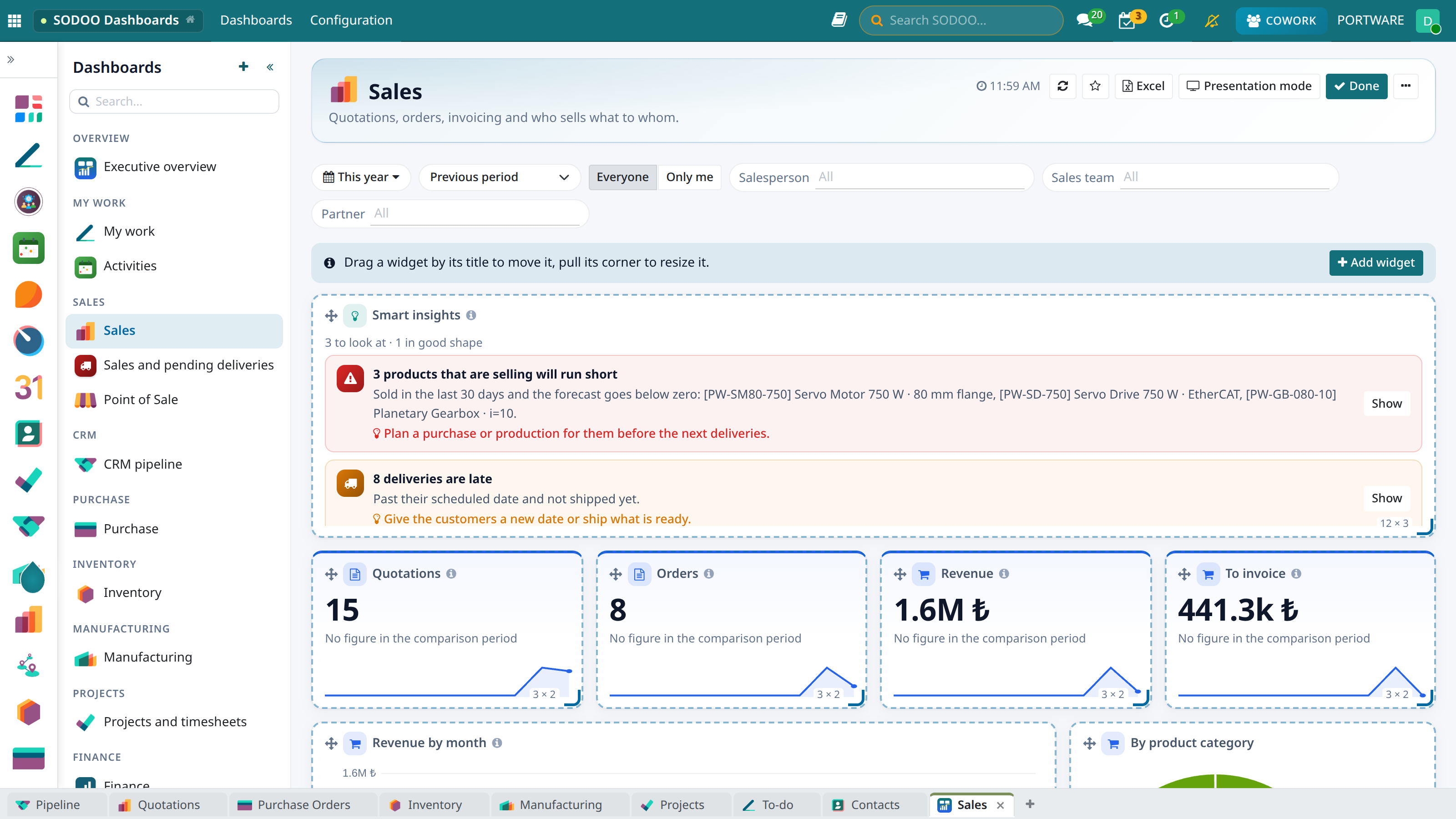
Edit mode - drag, resize, add a widget
In the widget form, the preview on live data on the right redraws at every change:
- Data from and Filter: which model and which records. For amounts, choose the report models converted to company currency (Sales Analysis, Purchase Analysis, Invoices Analysis).
- Date field: the date the period applies to. Left empty, the figure is "as of today".
- Aggregation and Measure: count of records, sum, average, minimum/maximum, count of distinct values.
- Group by / Then by: the axis and series of a chart, the rows and columns of a pivot.
- Group by (path) / Then by (path): grouping through a relation:
product_id.categ_idby product category,categ_id.parent_idby product family,partner_id.country_idby country. When filled it takes the place of the grouping beside it. - Ratio of: on a KPI or gauge shows the figure as a percentage: the records matching the filter as a share of the records written here. For example won opportunities / all closed opportunities.
- Target, A rise is good news, Invert the sign: what the colours mean; income and payables are negative balances in accounting and read positive once inverted.
- Colour, Icon, A colour per group: every widget takes an icon and a colour from its data's area (sales blue, finance indigo, stock amber, HR pink); you may choose your own. In charts grouped by something other than a date every bar, slice or series gets its own colour, and the same group (a product family, say) has the same colour in every chart and in Excel; "Others" is grey.
- Definition: one sentence the reader sees under (i). Give every figure a definition.
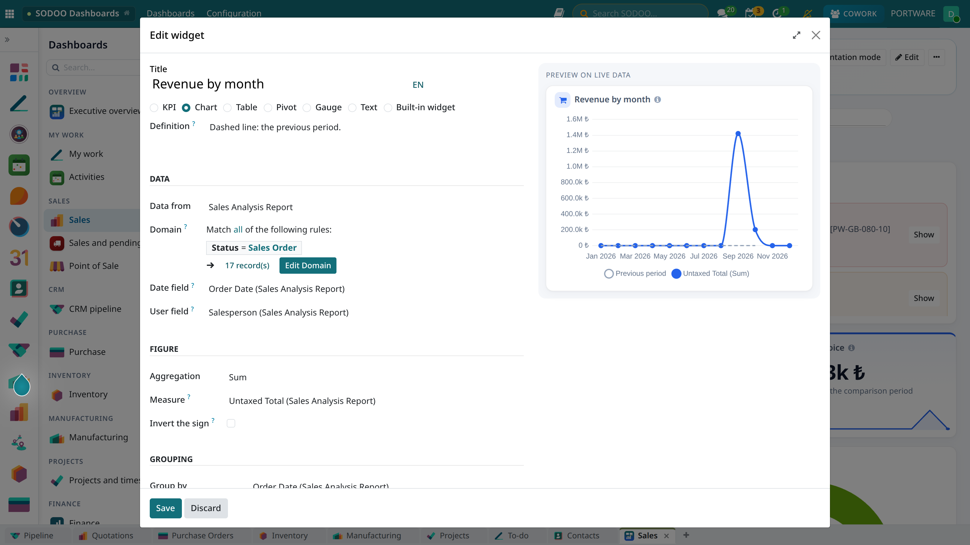
Widget editor - the definition on the left, the live preview on the right
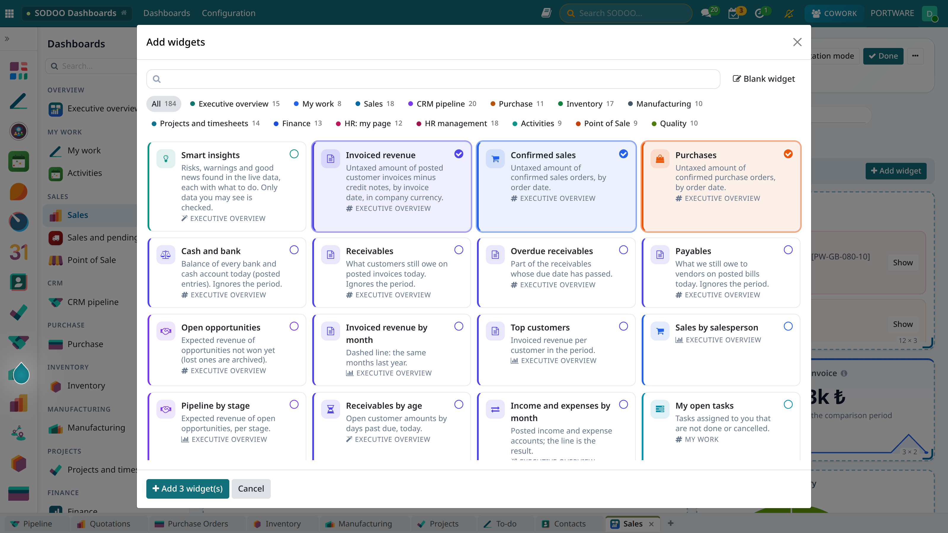
Widget library - ready widgets by area, several at once
"Add to Dashboard" from Every Screen
Built the table you wanted in a list, kanban, graph or pivot view? Choose Add to dashboard in its gear menu (). The search filters, grouping, measure and chart type travel with the widget; it works on screens opened from a button too. Pick the dashboard or name a new one; Add and open takes you there.
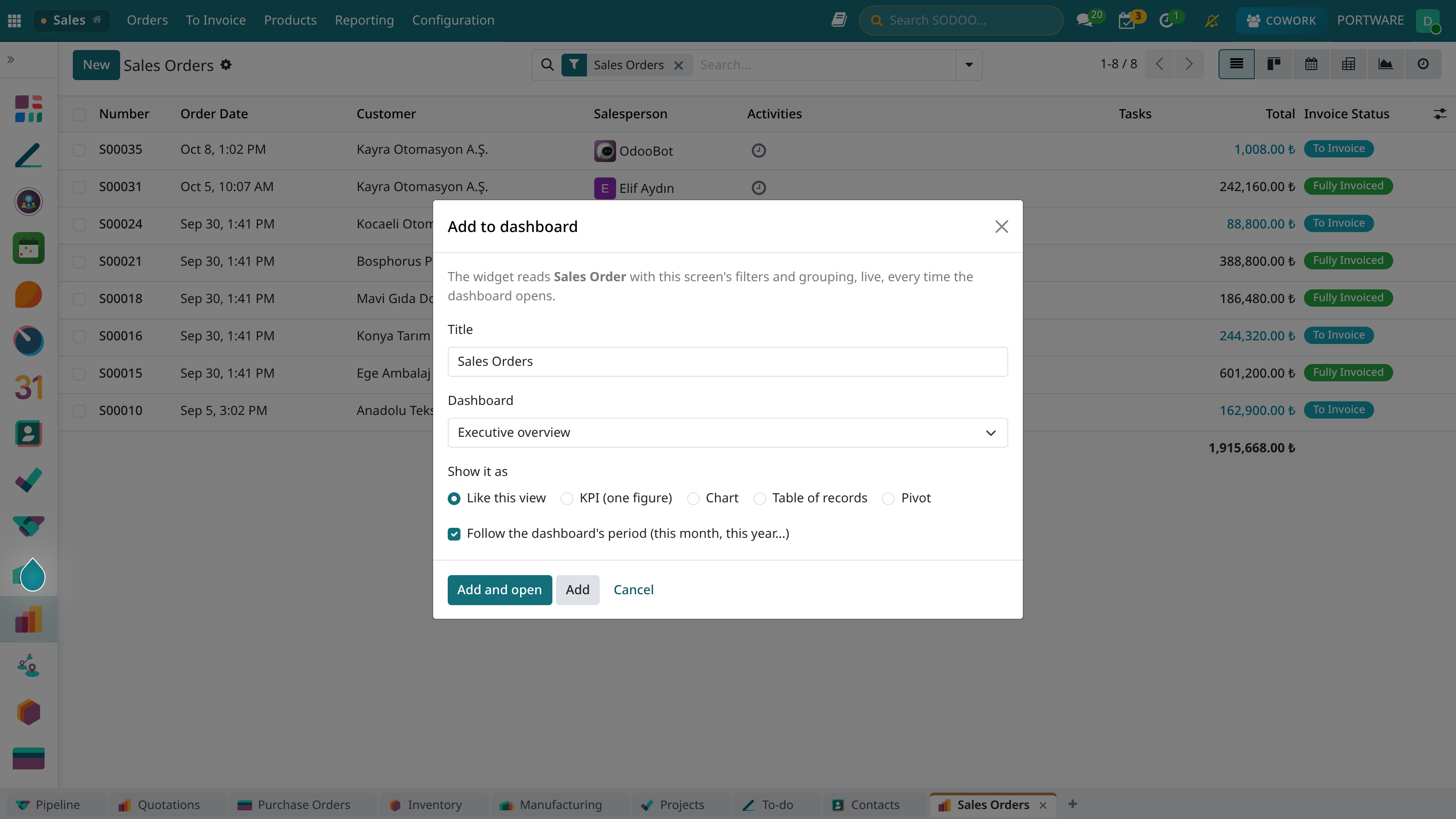
Adding the sales orders list to a dashboard
Excel, PDF, Presentation and E-mail
- Excel: the dashboard downloads as a formatted workbook with the current filters, click-to-filter picks and your own views. The first sheet follows the screen: framed cards on a light grey ground, KPI cards titled in the widget's colour with Excel's own sparklines, editable native Excel charts with figures on the bars, the smart insights and table previews. The workbook carries the data it needs: every KPI, chart and smart insight comes with the records behind it (with your rights, up to 1000 rows), and a click on its title or insight goes to that records sheet inside Excel. For example Open opportunities opens the opportunities sheet: opportunity, customer, salesperson, stage and expected revenue, as a filterable table with a total that follows the filter. Figures are linked by formulas: pivots come banded by category, band subtotals and the grand total use SUBTOTAL, row totals SUM, and in-cell bars bring the big figures forward; the previews on the first sheet read the detail sheets by formula. On the stock projection sheet Free, Projected, After quotations and Status are formulas: change a quantity and the line recalculates and changes colour (what if?). Negatives show in red, empty cells stay quiet. The Smart insights sheet lists the findings, what they mean and the suggestions; table and pivot titles open their own sheets and ← Dashboard on every sheet comes back. Contents reaches every sheet in one click. The only link out is Open live in SODOO in the header: the workbook is a picture of the moment it was downloaded, current figures live in SODOO.
- Print / PDF: from the ⋯ menu; menus and buttons are hidden on paper.
- Expand: point at a widget and press to bring it to the whole screen (Esc closes it); it works in presentation mode too, to focus a meeting on one figure.
- Presentation mode: full screen; the arrows move between dashboards, moves on every 30 seconds (for a meeting-room screen). For a wall screen, set Settings → Refresh every.
- Receive by e-mail: the dashboard comes to you daily, weekly or monthly as Excel; each recipient gets only the figures they are allowed to see.
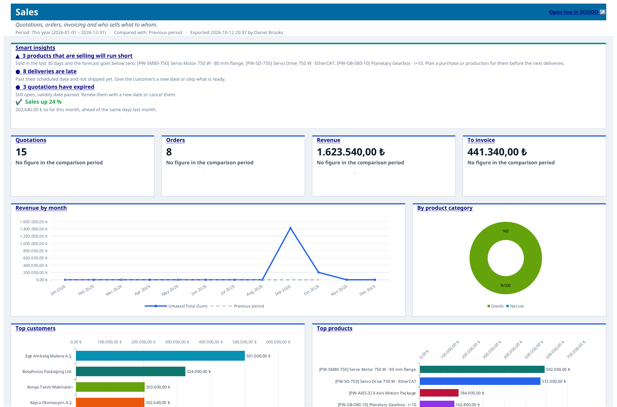
The Sales dashboard in Excel - KPI cards and native charts
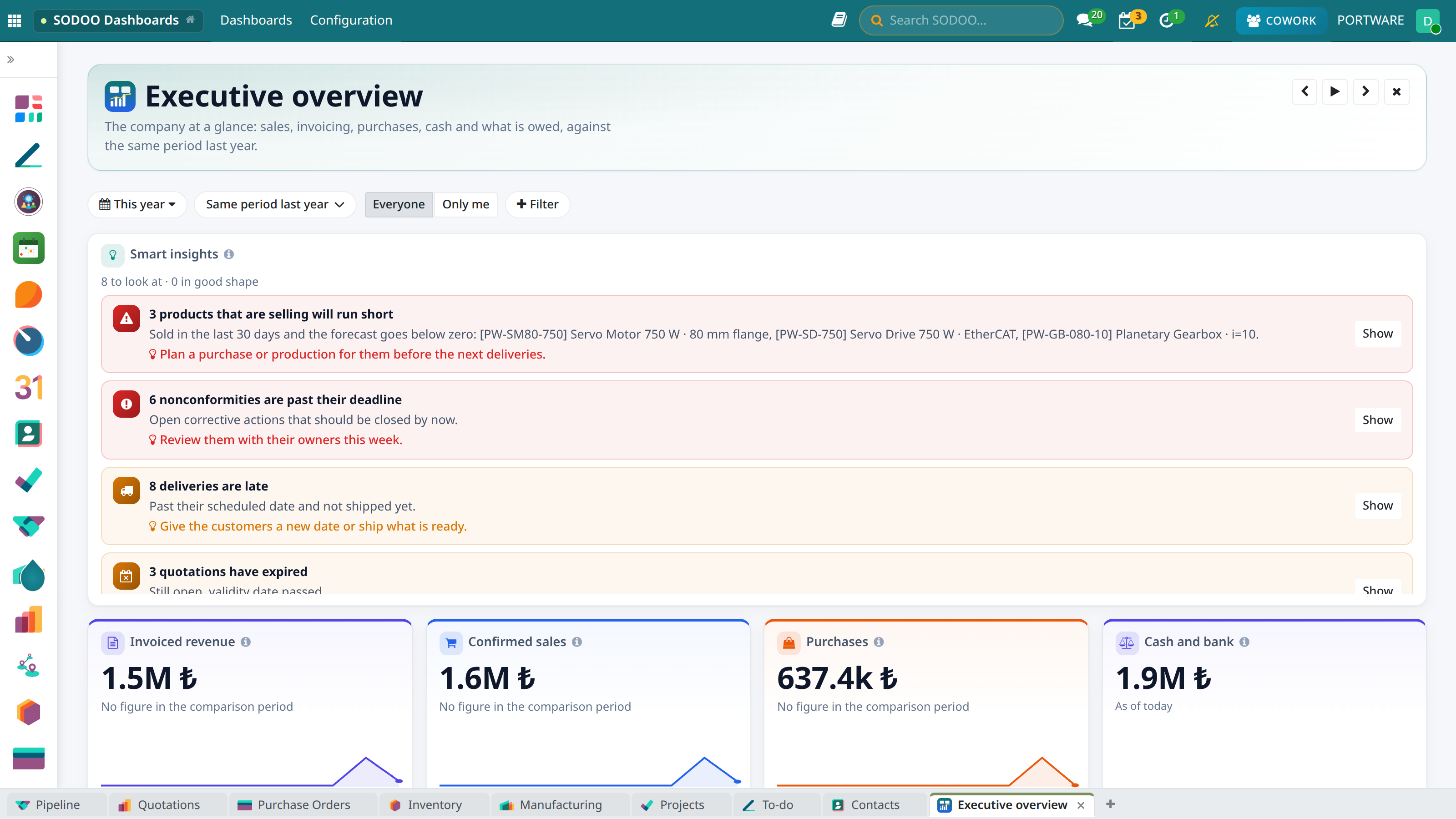
Presentation mode
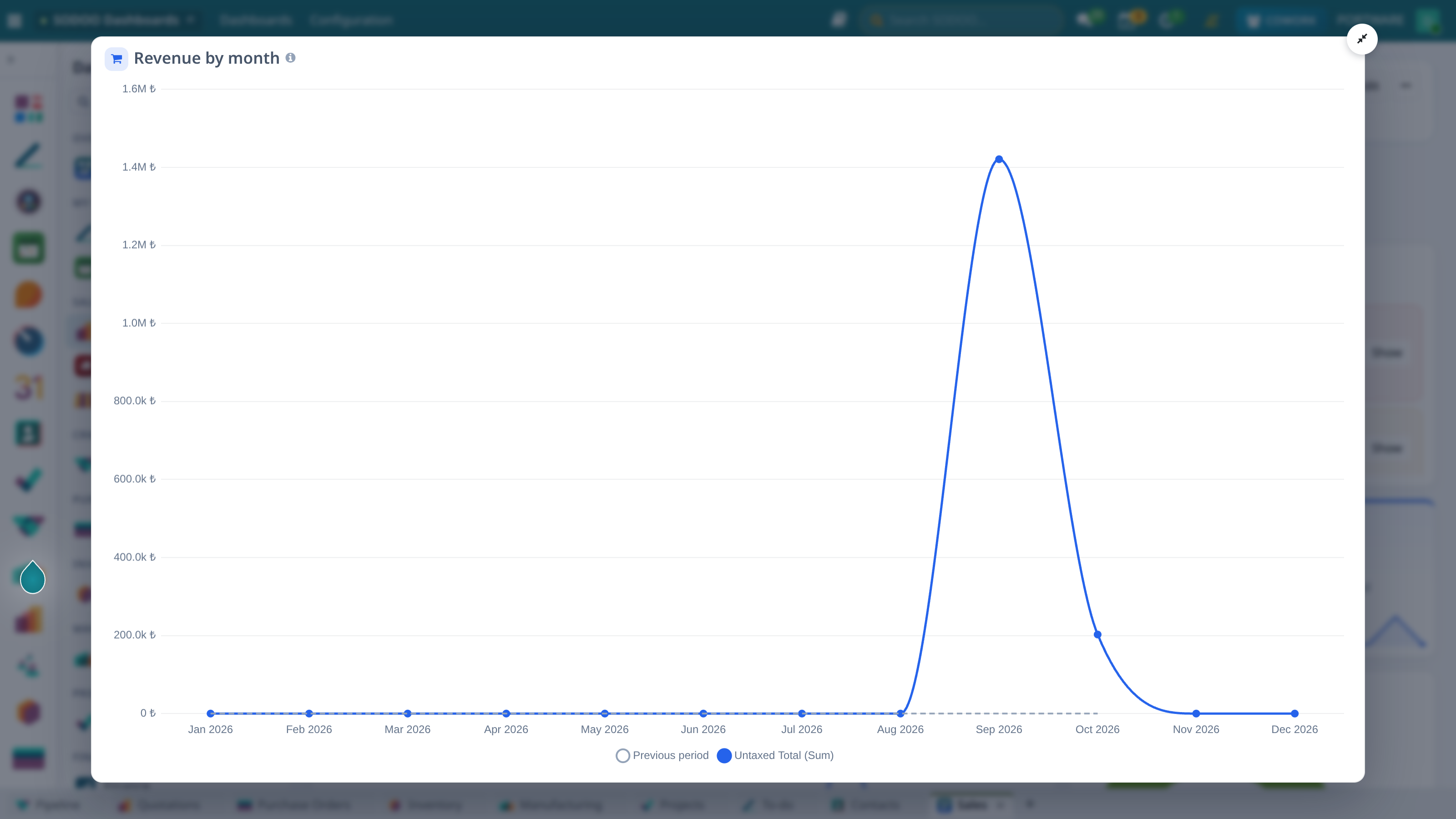
An expanded widget - one figure in focus during a meeting
Since 19.0.1.8: the Contents sheet opens with This period: the figures that moved most, where the targets stand, what drove the largest change and the most serious finding. A KPI card with a target writes the target, the status in words and the pace. Every metric of the page -- definition, owner, target, status -- is on the Metrics sheet, the notes on the Notes sheet. Insight levels are words in a coloured cell (Risk, Warning, Note, Good), not symbols.
Sharing and Rights
- Visibility: only me, chosen users, chosen groups or every internal user (⋯ → Settings and sharing).
- Editing: only the owner and dashboard managers (system administrators) change it. To change a shared dashboard, use ⋯ → Copy as my own.
- Data rights: widgets read with record rules and the company selection. A widget over data you have no right to shows a lock and says why; with a partial right only the records you may see are counted. Smart insights, Excel and e-mail follow the same limits.
Dashboards with SODOO Cowork
Tell Cowork in a sentence; it checks the field names against the database, puts the card up for your approval and builds the dashboard. It edits an existing dashboard too: changes its name, visibility, period and comparison, renames, updates or removes widgets. It only touches dashboards you may edit:
- "Build a dashboard with this year's sales by salesperson and month, the 10 largest customers and the open quotations."
- "What does the finance dashboard say this month?" (the smart insights first, then the figures)
- "Build a page from ready widgets showing stock and late deliveries."
- "Give me the sales dashboard as Excel with last month's figures."
- "Add late receipts by vendor to the purchase dashboard."
- "Rename the Sales and pending deliveries page, open it to everyone and set the period to this year."
- "Rename the Quotation amount widget to 'Open quotation amount' and remove the product family chart."
The SODOO HR Dashboard and SODOO Accounting Dashboard menus now open these dashboards.
Metrics and why: Cowork reads the metric catalogue (which figures are defined?), computes a metric with its value, target, status, pace and drivers (are we on target in sales, why did it fall?), sets a target with the owner's or a manager's approval (October sales quota 300 k) and explains a KPI's change on a dashboard. Ask the dashboard on a page opens Cowork beside it, knowing its figures; the answer rests on those figures and what the tools return. Building a dashboard, Cowork uses a metric where one exists ({{metric: sales_revenue}}).